
How to use different banner layouts on mobile and desktop (New Version)
Overview
Many Layout and Style controls support a mobile override so phones are not forced to use the desktop dialog.
On desktop you might use a Wide or Box notice. On a phone that same width can cover the product page. The New Banner lets you keep desktop as-is and choose a Bar, smaller size, or different position on mobile.
Overrides are stored as Mobile same as desktop vs Mobile different from desktop.
Before you start
- Confirm you are on Cookie banner with the New version badge.
- Use the previewer Desktop / Mobile toggle while you edit. See Using the Live Banner Preview mode.
Set mobile independently
- Open Shopify Admin > Apps > Pandectes GDPR Compliance.
- Go to Cookie banner.
- Open Layout (and Style if you also want different colors, padding, or logos on mobile).
- Find a control that shows Mobile same as desktop.
- Switch it to Mobile different from desktop.
- Set the mobile value (appearance, position, size, button layout, and so on).
- Repeat for each control you want to override.
- Save.
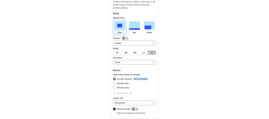
Common Layout overrides:
- Cookie notice Appearance (Box, Bar, Wide)
- Position
- Width (XS to XL)
- Button layout
- Preferences appearance (box, drawer, sidepanel)
Common Style overrides:
- Spacing, radius, and float
- Font size
- Button size
Suggested mobile setup
- Prefer a Bar at the bottom on mobile so product images stay visible.
- Keep Accept and Decline on one row when you can.
- Check the consent widget position so it does not cover Add to cart or a chat bubble.
Verify
- Preview Mobile in the app.
- Open the storefront on a phone or Chrome device mode.
- Confirm both first visit (banner) and returning visit (widget).
Related articles
- Customizing the layout of the banner (New Version)
- How to customize banner style, colors, logos, and buttons (New Version)
Updated on: 05/10/2026
Thank you!