
How to customize banner style, colors, logos, and buttons (New Version)
Overview
Layout (position and dialog type) is covered separately. If you are moving from the Legacy Banner, see Migration Guide: Recreating your Legacy Look in New Version.
The Style tab controls how the banner, preferences dialog, and consent widget look. You can upload logos, choose button styles, set colors (including light and dark), adjust surfaces and fonts, and add custom CSS.
Style does not change when cookies are allowed. Consent rules stay in All settings > Consent model & regions.
Legacy steps: Migration Guide: Recreating your Legacy Look in New Version.
Before you start
- Confirm the Banner page shows the New version badge.
- Use Enable for admins if you want to test on the live store without showing the banner to visitors. See How to enable, disable, or test the banner in admin-only mode (New Version).
- Use the in-app preview (Desktop / Mobile, Light / Dark) while you edit.
Open the Style tab
- Open Shopify Admin > Apps > Pandectes GDPR Compliance.
- Go to Cookie banner.
- Open the Style tab.
- Save when the unsaved-changes bar appears.
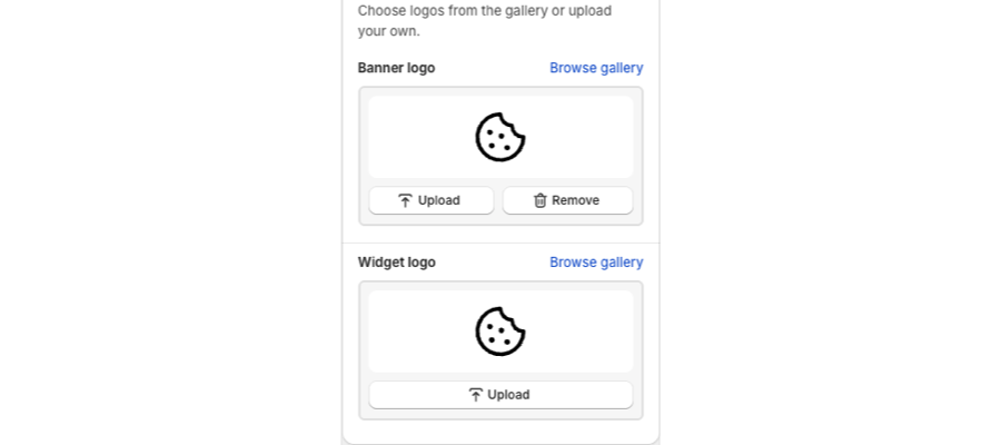
Logos
You can set a logo for the main banner and a separate logo for the consent widget.
- Banner logo: appears in the cookie notice and preferences header (unless Hide header is enabled on Layout).
- Widget logo: appears on the consent widget.
Upload a PNG or JPG, or pick a logo from the gallery. After you save, storefront updates can take a short time to appear.
Buttons
Button settings apply to primary actions (Accept / Deny all) and secondary actions (Preferences / Save).
Typical options:
- Filled or outlined (ghost) variants
- Size and corner radius
- Border
- Bold button labels (fonts section)
Use a filled Accept button and an outlined Decline button when you want Accept to stand out. Google’s banner requirements still need a clear Decline and access to preferences. See How to create a banner that meets Google’s banner requirements (New Version).
Colors
Choose a color mode (for example light or dark), a preset, or your own colors.
- Base, primary, secondary, and accent colors drive backgrounds, text, and buttons.
- Auto calculate / auto-adjust can derive a palette from your Shopify theme so you do not enter every hex value by hand.
- Preview Light and Dark backgrounds in the live previewer so the banner stays readable for visitors who use dark mode.
Surfaces, fonts, and animations
- Surfaces: padding, corner radius, float (hovering window), border, shadow, and z-index (how the banner stacks above other theme elements).
- Fonts: family and size. Leave empty to follow the store font.
- Animations: enable or disable motion and set duration. Layout still chooses the animation type (fade, slide, zoom, grow).
If the banner sits behind a sticky header or chat widget, raise z-index. The maximum value is 2147483647. See How to fix the banner hiding behind theme elements (New Version).
Custom styling (CSS)
For changes the Style controls cannot do, use Custom styling / CSS Rules on the same tab. Rules apply inside the pandectes-cmp web component.
Mobile vs desktop
Many Style fields can differ on mobile. Use Mobile same as desktop or Mobile different from desktop. See How to use different banner layouts on mobile and desktop (New Version).
Related articles
- Customizing the layout of the banner (New Version)
- How to edit banner texts and links (New Version)
- How to enable and customize the Consent widget (New Version)
- Custom styling with CSS
Updated on: 05/10/2026
Thank you!