
How to choose a shape, icon and colors for the legal guarantee notice
Overview
By default the legal guarantee notice is a simple text link under Add to cart. On the Plus plan you can give it a shape that fits your theme, with an icon and your own colors. The Design card on the Notice & label page holds all of it, with a live preview on the right.
Before you start
- The app installed and the notice working on your product page. See How to install and set up Pandectes EU Warranty & GARAN.
- The Plus plan for any shape other than Text link. On Basic you can pick the text link and set its color and underline. See Basic or Plus: which Pandectes EU Warranty & GARAN plan do you need?.
Pick a shape
- Open Shopify Admin > Apps > Pandectes EU Warranty & GARAN > Notice & label.
- Scroll to the Design card and find Shape.
- Select one of the five shapes.
- Check the Preview on the right, then save.
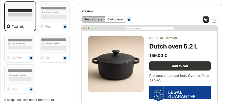
Shape | What shoppers see |
|---|---|
Text link | A simple text link under the "Add to cart" button. Included on Basic. |
Row | A line that matches your theme's collapsible rows, like Shipping or Materials. |
Button | A button with the same corners and lettering as your "Add to cart" button, and GARAN in a matching frame below it. |
Pill | A small rounded label, and GARAN in a matching pill below it. |
Box | One frame around both the legal guarantee and GARAN. |
On Basic, the shapes other than Text link show a Plus star. During onboarding you can try every shape in the preview, but on Basic shoppers see the text link.
Settings for a shape
Once you pick a shape other than Text link, a Details section opens under the picker.
Setting | Options |
|---|---|
Strength | Subtle, Medium or Strong. Button offers Subtle and Medium. Box has no strength setting. |
Icon | Shown at the start of the label. Choose Check mark, Info, Note, Calendar, Question mark, Shield, Certificate, Official document, Award (the default), Duration, or No icon. |
Width | Full width or Fit the text, for the shapes that offer it. |
Corners | Same as the "Add to cart" button, Square, Soft, Round or Pill. |
Font | Your theme's font or System font. |
Colors
Match my theme colors is on by default, so the colors follow your theme. Turn it off to pick your own:
Color | Used for |
|---|---|
Accent color | The icon, outlines and, on most shapes, the "Legal guarantee" label. Also the fill on Strong, and links unless you pick a link color. |
Text color | The rest of the text, such as the label on Box, and the lines unless you pick a line color. |
Background color | Fills the shape you picked, and the GARAN frame on Button and Pill. Leave it blank for no fill. |
Line color | Lines, outlines and frames. Blank follows the text color. |
Link color | The links under the legal guarantee and GARAN. Blank follows the accent color. |
Select Use default colors to go back to the defaults. Enter colors as hex values, for example #202223.
If a color pair is hard to read, a Some colors may be hard for shoppers to read warning lists which pair and suggests a darker or lighter color. The check compares text, links and accent colors against the background, and against a white page, as in the preview.
Underline links underlines the links under the legal guarantee and GARAN. With the Text link shape, the Text and link color and Underline links controls apply instead.
Starter CSS (optional)
With Custom CSS on the Plus plan, Advanced offers an Add ... starter CSS button for the shape you picked. It adds a starting point to Custom CSS.
Check it on your storefront
- Open a product page in a private window.
- Look under Add to cart. You should see the shape you picked, with your icon and colors.
- Open the notice. The official artwork is unchanged.
Related articles
- How to configure the legal guarantee notice
- Basic or Plus: which Pandectes EU Warranty & GARAN plan do you need?
- The EU legal guarantee notice and GARAN label explained
Updated on: 27/10/2026
Thank you!